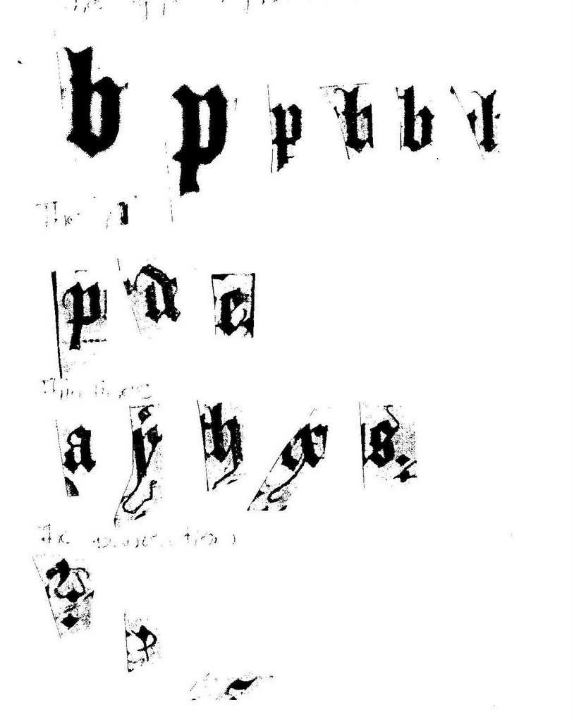
I got my images of the Bedford Hours and Psalter printed out this morning, and have assembled some pen practise, particular to the B.H.
It seems to come down to the dipped top and bottom of ascenders/descenders (described how to do in Harris), and some edge-of-nib pen flourishes, which I need to practise. There is also the little curved line on the top rhs of the x, the top rhs of the s, the top of the a and probably elsewhere. It's a bit hard to see clearly on the scan.
This won't be the complete set, but it gives me a good start.
Some are obviously more informal than others - the 'fishhook' shade in the second line and the line for the 'a', versus the flourishes on the y and x. The y definitely looks a bit bodge!
The punctuation is included for the pen flourishes on it - not as a complete set of the punctuation.
Going to try using Higgins Eternal in my Brause nib tonight. I complained to Kit that I was either getting overloading or no ink, and she suggested a thicker ink than the Art Spectrum I use for practise with a William Mitchell.
I won't be able to collect the complete set of Majuscules, because I don't have enough images/pages. I'll have to look through the various sets shown in various exemplar books, and choose the set that is closest to the majuscules that I do have.
I've also put together the 'master list' of script and illumination analysis questions from Meisterin Helene, Drogin and Lochac college. It's all handwritten at the moment. I may be inspired and type it up.
Later : The Higgins Eternal ink is working much better.
Was reading in Drogin - Lombardic versals were used with g.t.q.. But 'capitals' (majuscules) developed about then. So there's some history there to remember to include later, plus two sets of majuscules to determine, not just one (the form of the Lombardics, plus the capitals)
This entry was posted
on Wednesday, September 20, 2006
at 3:38 AM
. You can follow any responses to this entry through the
comments feed
.


