Akiko, I'm not suprised that you said that you were confused. I certainly have been.
I'll try and explain .....
The ductus books (ie all the books showing how you write the gothic script, of which there are a million) state there is 1 pen width between each letters within a word. And also 1 p.w. as the counter space within a letter.
I've always known this, but I never noticed the 'picket fence' effect this achieves before. (and I'm wondering if it's a bit more complicated than that in the actual historical writing)
I've noticed the issue because I've been looking at pages from the Bedford Hours (and other examples since, to check it out further, such as the Luttrell Psalter - looking at textura precissus is a bit easier because the writing is clearer.)
By "picket fence" I mean that if you take a piece of gothic writing and cover over the top half of the writing, you can see 'a picket fence' effect of the bottom half. - all that equal spacing between the VERTICALS, whether they are from within the one letter, or within the entire word.
This is much more of a 'textual' effect. The verticals take up a lot of real estate on the page, so having them even makes the whole thing look even.
Have a look at these words, taken from the Michelle Brown example I scanned in entirety in the last entry
Here is "oderunt" :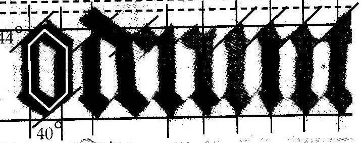 o to d - the spacing between is 1 p.w, and the same whether you measure the space between the letters, or measure the distance between the last vertical of the o and the first vertical of the d
d- e - this is a ligature. This is just a paleographical rule that the scribes used for various combinations of letters. The two letters share a vertical.
e -r - look what happens here! That ain't no 1 p.w. between the e and the r! But there is 1 p.w between the verticals of the two letters. And this makes it a textual pattern - nice and even.
r - u - again, they are right up against each other - no 1 p.w. between the letters, but there is 1 p.w. between the verticals of the r and the first vertical of the u.
u - n - now we're back to 1 p.w. between the letters, which is also 1 p.w. between the verticals.
n - t - are just touching. Not 1 p.w. between the letters, but there is 1 p.w. between the last vertical of the n, and the vertical of the t.
Now have a look at 'gratis' :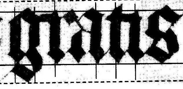 Can you see the same thing happening?
The thing to do seems to be to equally space the verticals, NOT finish a letter, move along one pen width distance and start the next one. The latter will work for some letters, but moving along one pen width from the last vertical to the next vertical is ALWAYS true
I can say one thing - having a constant one pen width between the letters (not the verticals) would make the writing a lot more readable.
To document my journey of confusion along the way :
: At the beginning of all of this, a couple of weeks ago I discovered that :
In my writing, I was altering the space sometimes for 21st century readability. I discovered this when I first wrote out that "Gods of Snow" quote with all the n,m,i,u's and my spacing was nothing like that in the exemplar in Drogin.
: Then, I talked here in the blog about equal space between DIAMONDS. Because I was thinking only about n,m,u,i,'s because that was in the quote.
Then (days later) I realized that it was the spacing between the verticals that was relevant, not the diamonds. It's only in n,m,u,i that the letters are simply vertical (for i), vertical...vertical (for n,u) (and more verticals for m). With all the other letters it gets more complicated - a,b,c,d,e,f,g,h, and so on have more construction in them. I needed to look at the verticals, not the diamonds.
I hope that explains what the last couple of weeks of posts have been about.
This entry was posted
on Friday, September 29, 2006
at 2:37 PM
and is filed under
Gods with Snow - Vertical Lines Exercise,
The Bedford Psalter - Script Analysis: Spacing
. You can follow any responses to this entry through the
comments feed
.


