Here you are Akiko dear.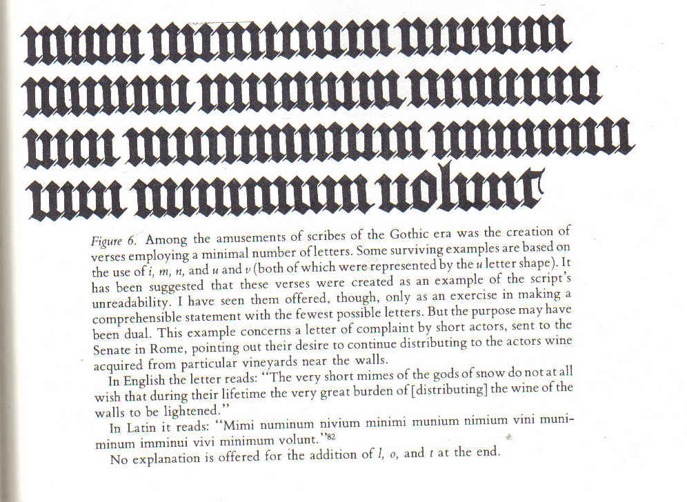
This is from page 67, Marc Drogin, Medeival Calligraphy - It's History and Technique - a book I could not survive without.
The quote is not from the Bedford Hours - it's just a quote manufactured for the qualities of it's letters, same as an abcdarium.
Note that space between the points, both top AND bottom is exactly the same.
In the reality of using other letters as well and more normal sort of writing : :
Below is an extract of the B.H. that Stan Knight chose to blow up (Gothic Scripts - Textura Gothic - D4, which is the page id, from the book Historical Scripts")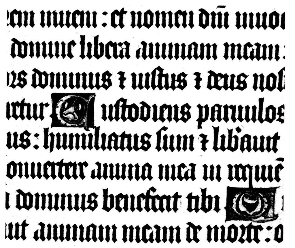 .
.
If you choose a picket fence sequence (m,n,u,i,) - I've been going for "minus" of the dominus, and part of the "humiliatus", you'll see that the spacing is very close to regular (4 or 5 mm, I forget) between the points, top and bottom. (well you'd hope it's the same at the bottom, with straight verticals!). The m, n, u - that's where they do get a bit bigger here, even tho they didn't in the Gods with Snow quote above.
Noticing this (why did anyone TeLL me!) has changed my script enormously just in yesterday's practise. It's much better.
Maybe someone did tell me, but I wasn't listening.
This entry was posted
on Saturday, September 23, 2006
at 4:28 PM
and is filed under
Gods with Snow - Vertical Lines Exercise
. You can follow any responses to this entry through the
comments feed
.


