I've had a go at writing out the Gods with Snow quote with a pen width that matches the one shown in the copy of the quote shown in Drogin, and at the same x-height. My Brause nib matches the nib width (a bit smaller) - yay - I love my Brause.
I'm pretty drugged at the moment - been mainlining coffee but it hasn't had much effect, so I'm not proud of this writing, - there are some non-straight lines when I know perfectly well that I can do better - but it does show something interesting.
Part way through, I was disappointed about the shape of my verticals (not being evenly shaped and edged verticals lines) so I raised the height of my chair a bit, sat up straighter and made sure that I was holding my pen upright. I've marked the point where I did this with a purple pen.
Have a look at the improvement in the shape of the verticals it made! (See it better viewing at a larger size by clicking on the image).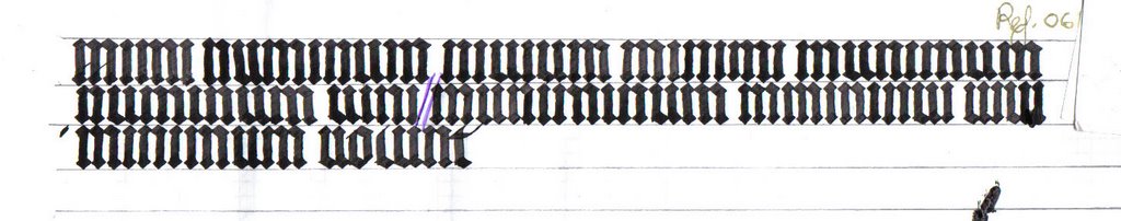 Many more of the lines are crisp and less likely to bow.
I know that the other important thing in getting straight lines (rather than ones that bow) is remembering to move the elbow when drawing them - tho these lines are so short at an x-height of 1 cm that it's hard to get any movement going
Later
I've written it out again - more crisp verticals this time.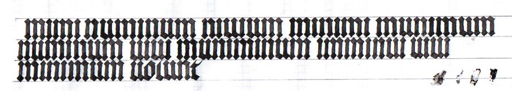 However, there are still problems. I'll whip the page out of the scanner and mark them up and then put it back in .......
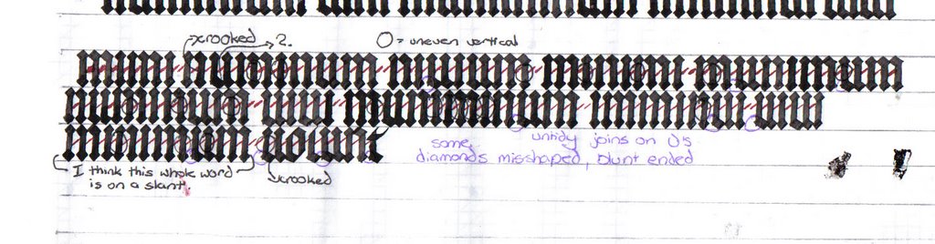 No, I'm not being too hard on myself. I need to know where and what the problems are in order to fix them! :-)
I forgot to mark on the page where I've bowed the tops of Ms and Ns.
On the spacing front, as usual I'm putting my I's too close after the last vertical, and my width of my N's is a bit variable. All the counterspaces of the M's are even, which is some kind of miracle. Spacing the words a bit far apart.
I'm very happy with some of the letters ....
This entry was posted
on Tuesday, October 31, 2006
at 6:50 PM
and is filed under
Gods with Snow - Vertical Lines Exercise
. You can follow any responses to this entry through the
comments feed
.


